![]()
![]()
|
|
Light effects can add more than the usual flare to an image. The filters you find here are valuable accessories in your Gimp utensil kit. |
FlareFX
| |
|
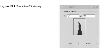
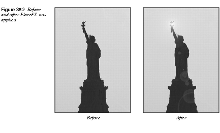
FlareFX is a simple and well-made lens flare filter. It's easy to place the flare with the hair cross in the preview image, but if you need more precision, you can type the coordinates directly into the value fields. If, for example, you type 300/50, the position of the flare will be 300 pixels from the left and 50 pixels from the top of your image. (Note that you can't change the color or intensity of the flare, unless you change the parameters in the source code.) | |
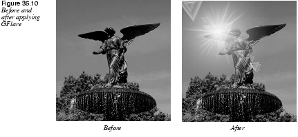
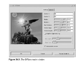
Gflare
| |
 |
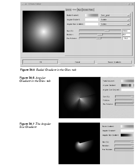
The GFlare filter may well be one of the most advanced flare-makers there is. One of the best features in GFlare is that you can create different gflares for different situations, and load them in the Selector tab folder. This is also the right way to work with this plug-in. When you need a different gflare-pattern, just copy one and edit the copy until you are satisfied. We think this is the best way to learn how to use GFlare. After that, you can learn how to use the Settings tab folder. How To Use GFlare |
 |
Let's get started. Press the Selector tab, copy the default pattern and name it something appropriate in the name dialog. Then press edit, and a new dialog will pop up -- the GFlare Editor.
|
 |
Tip: Just remember to create a |
Light Effects
| |
 |
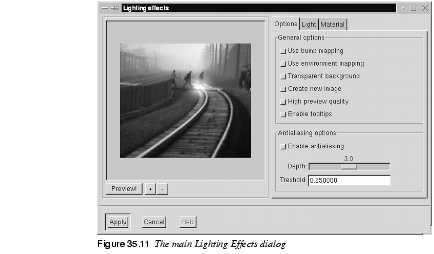
If you want to try some traditional light effects like lighting up a wall with a spotlight, Light Effects is the filter to use. The Main InterfaceIn the main interface of Light Effects you'll find a preview window and a tab folder for Options, Light and Material. To look at what you're doing, you must first press the Preview button. There's no auto-preview because that would slow things down. Every time you do something with this filter, like changing a parameter, you need to press Preview to get a grip of what's happening (don't forget this). You can also zoom the preview by pressing + or -.
OptionsUse bump mapping: This button turns on the bumpmap function which will add a 3-D effect to the image. When you enable bumpmap, a new tab will pop up. Use environment mapping: This option will pop up a new tab where you choose the image that will make up the environment. Transparent background: If you have selected the bumpmap option, you can make your image transparent where the bump height is zero (bump height is zero in all black areas in the bumpmap). Create new image: With this option enabled, all changes will appear in a new image instead of in the original one. This is nice, because you don't always want to alter the original image. High preview quality: This option is nice, but it slows down the filter. Use it when you have made all changes and want to take a final look at your work before you apply the filter. Antialiasing: Enables you to turn antialiasing on or off. We recommend using it, otherwise the images will look very jagged and ugly. Depth refers to the amount of antialiasing -- the higher the value, the better the antialiasing, but it will also be conceivably slower. Threshold determines the limit of antialiasing -- the process is interrupted when the difference between pixels is lower than the value in the input field. LightYou can set the Type of light, the Light color and the Position of the light source. Type Of Light· Point light is a sort of spotlight that shines straight onto your image. · Directional Light is a softer point light (more like a normal lamp in the ceiling). · Spot light is harder and more focused than point light. Light ColorTo set the color of the light, press the Light source Color button to access the Select light source color dialog. Here you can select a suitable light color, just as you would in the Color Select dialog in the toolbox. Position For Point LightThere are three coordinates for controlling light position -- X,Y and Z: · The X-coordinate moves horizontally from -0.5 to 1.5, where -0.5 is the left-hand position, and 1.5 is the right-hand one. · The same goes for the vertical Y-coordinate; -0.5 is at the top and 1.5 is at the bottom. · Z is the depth of the light, where 0 would be the flat surface of the computer monitor. There is no upper limit for this coordinate. There are no limits for X and Y either; the values are only recommendations 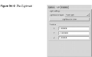
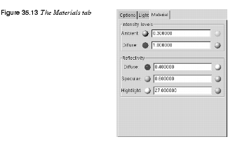
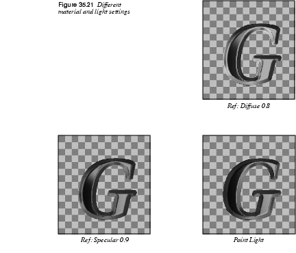
MaterialsYou can specify the appearance of the rendered light to give an image or selection material characteristics. You do this by controlling the Intensity Levels and Reflectivity parameter fields. The little spheres represent the properties of the material. Low values make the material looks like the left sphere, and high values make it look like the sphere to the right.
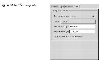
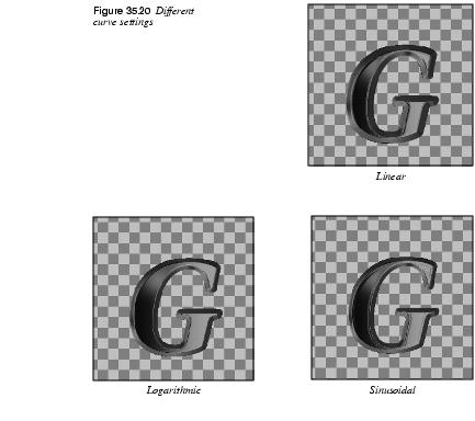
The values specified at the end of each paragraph that follows are suggested max/min values. Intensity Levels· Ambient can be described as the intensity of the surrounding light that shines on the object. The brightest areas will not change intensity, but darker areas will get lighter as you increase this value. Think of your holiday snapshots, where very intense sunlight will produce bright and contourless features with very pale shadows (0.1 -> 3.0). · Diffuse can be described as the intensity of the directional light that shines on the object. The darkest (shadow) areas of the object never get darker, but brighter areas turn brighter as you increase the Diffuse value. This is like the difference between cloud shadow and sunlight, or a dull and a shiny object (0.5 -> 3.0). Reflectivity· Diffuse controls the contrast and distribution of light between the object and the reflection highlight. The mid-values are affected with this parameter. The glossier an object is, the darker the mid-values will be, because the contrast with the highlight spot will be greater. A dull/plastic object will have little highlight contrast in real life, so don't set this value too high if that is the effect you wish to achieve (0.2 -> 0.9), with a nice value around 0.5. · Specular controls the brightest values, or the sharpness/softness of the highlight, because a brighter highlight will have greater contrast to the mid-values. A glossy/metallic object will have bright highlights with sharper edges, and dull objects will have a dull, if any, highlight with soft, blurry edges (0.4 -> 0.6). · Highlight controls the size of the highlight by changing the relation between the brightest/darkest areas and the mid-values. Higher values will make the highlight smaller, with a smoother mid-value distribution. Lower values will make it larger, and the darkest shadow areas will also be larger, which means that the transition from bright to dark will be more abrupt (15 -> 50, but around 20 -> 30 is best). BumpmappingBumpmap is similar to Bump Map, so it's a good idea to check that passage out before you start. You can only use grayscale images as bumpmaps, so if you want to bumpmap against the original image, you have to duplicate it and change it to grayscale mode in the image menu. You can set the bump curve to Linear, Logaritmic, Sinusoidal or Spherical. Look at the curves in the bumpmap filter to appreciate the difference. You can also specify the maximum and minimum height/depth of the bumpmap.
Environment MappingIf you use environment mapping, you'll get the opportunity to place your object in a setting of your own choice. You can choose from all images opened in Gimp, regardless of size and shape. Environment Mapping will make the image you created look like it's inside a sphere, and the inner surface of this sphere is covered with the distorted environment image. Light is reflected from the sphere, and the image inside will reflect the environment mapping. |
 |
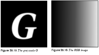
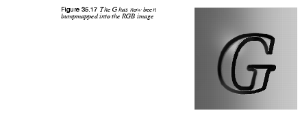
A Simple Tutorial 1. Create a new grayscale image (256x256) with a black background by using 2. Bring up the Text tool in the toolbox and type a white 200 pixel "G" with the Utopia font. Place the white letter in the middle of the grayscale image, as shown in Figure 35.15.
3. Create a new RGB image of 256x256 pixels. 4. Bring up the Blend tool from the toolbox and select to blend with a custom gradient from the Gradient Editor. 5. Open the Gradient Editor with the 6. Apply a linear gradient from the left to the right in the RGB image, as shown in Figure 35.16. 7. Bring up the Lighting Effects filter from the RGB image. 8. Check Use bump mapping and Use environment mapping in the Options tab folder and press Preview. (If there are other opened images in your Gimp session, first make sure that you use the RGB image as environment map and the grayscale image as bumpmap.) You should now have a nice bumpmapped and highlighted G (Figure 35.17).
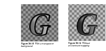
9. Check Transparent background. You will now see your G floating in a transparent surrounding Figure 35.18 . 10. Uncheck the environment mapping, press Preview and look at the difference (Figure 35.19). 11. Now, bring up the Alien Map filter with 12. Check Use environment mapping, press Preview in the Lighting Effects dialog, and you'll get a brand new color gradient. Test different types of light sources and light colors and different kinds of material reflections, and watch the difference here with Directional light (just remember to press Preview).
|
Sparkle
| |
|
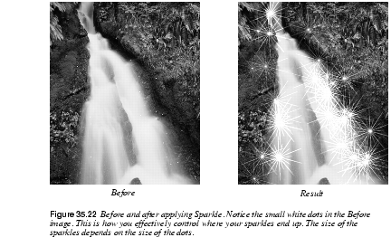
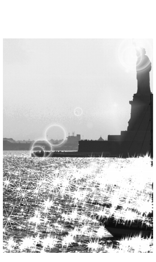
With Sparkle you can add sparkles to your image and get a frosty, glittery feeling to an object. Using SparkleSparkle will select the brightest parts of your picture and put a sparkle there. This behavior can make it rather difficult to predict where the sparkles will go. If you try it in a selection, you will get more control over where the sparkles end up, but The best way is generally to use a transparent layer (or a black layer + screen mode) where you put tiny white spots. This way, you can make sure that the sparkles will only appear where you want them to be.
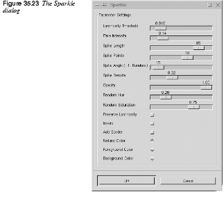
Parameters· The Luminosity Threshold controls the amount or density of sparkles. It computes the luminosity values of all pixels and selects the brightest pixels to be the center points of the sparkles. Just how bright a pixel has to be to create a sparkle is determined by this threshold. A low value (like 0.001) will probably only produce sparkles at very bright parts of your image, because only 1% of all pixels will be considered bright enough, and the flares will also be rather thin and small. There is generally no reason to use a higher Threshold value than 12%, even when you want a lot of sparkles. High values increase processing time enormously, and usually only result in big white blotches in the image. | |
|
|
Note: One decimal too many snuck into this parameter's slide bar - 0.001 should read 0.01 or 1%. · Flare Intensity: Determines the light intensity of the flare around the stars. If your sparkles look hard and unnatural, you have obviously set the Flare Intensity too high, and if you can hardly see the spikes, you need to increase this value.
· Spike Length: Controls the length of the star spikes. Note that the minor spikes start fading almost immediately, while the major spikes only start to fade away after a number of initial pixels with the same or similar value to the center pixel. · Spike Points: Specifies how many spikes will radiate from a pixel. Five spike points will produce five major spikes, and five minor spikes. If you use an uneven number of spikes, major spikes will be placed opposite minor spikes. For even numbers, a major spike will meet with another major spike. · Spike Angle: The angle of the first major spike and the horizontal axis of the star. If it's set to zero, that spike will be horizontal, and the other spike points will be evenly distributed around the star's center. A 90 degree spike angle will produce a vertical spike, and so on. If you set the Spike Angle to -1, you will get a randomly chosen spike angle for each spike point. As each pixel within the threshold range produces the given number of spikes, almost all of those spikes will be visible if you use random spike angles. When you use a fixed angle, the many spikes in bright pixel clusters will arrange themselves almost on top of each other so that the cluster will appear as one big, bright star with a limited amount of spikes. The result of a random spike angle is more organic than optical, meaning that a sparkle created with random angles has more in common with a dandelion seed or cobweb cluster than with the geometrical reflex from a crystal or lens. · Spike Density: Does not control the number of spikes, but the number of sparkles or stars. If you set Spike Density to 0.50, only 50 percent of the chosen pixels will produce a sparkle. Note that those 50 percent are chosen randomly; bright pixels are not favored. · Preserve Intensity: Controls how much of the original intensity in the center pixel should be preserved. In practice, this means that lowering the Preserve Intensity value will increase the intensity of the stars, because all center pixels will get maximum intensity (when PI=0), regardless of their original value. · Opacity: Adjusts the opacity of the stars. As you lower this value, the sparkles will successively get more and more transparent, so that you can see what's in the layer beneath. If you're using a single background and alpha is not enabled in your image, lowering this value will reduce saturation and value in the stars, making them look dull and dark. · Random Hue and Saturation: Add a color shift to your sparkles, but it will only be visible if the sparkle color was heavily saturated from the start. · Inverse: Reverses the sparkle effect so that instead of searching out the brightest pixels, the darkest pixels will be found and used as center points of black stars. Because black or dark star clusters tend to look like hair or grass rather than sparkles, you can get quite amusing results by running this filter with the inverse button checked. · Add Border: Draws a border of spikes around the image, giving it an interesting feathered edge. The softness of the edge is determined by the Flare Intensity and Preserve Intensity parameters. · Spike Color Settings: Allow you to choose another sparkle color than the natural colors found in the image. You can use the Foreground Color or the Background Color in the toolbox to tint your sparkles. The added color will appear as if in Screen mode for normal settings, and in Multiply mode for Inverse. However, if the chosen color is bright/dark enough, the chosen color will just appear at the semi-transparent edges of the white/black sparkles. |
Super Nova
| |
|
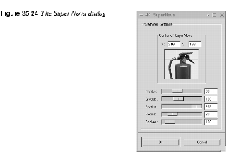
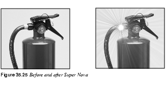
The Super Nova plug-in creates a big shiny super nova in your image. The R,G and B slides determine the color of the super nova. You specify the color just like in the Color Selection dialog (which you access by clicking in one of the color swatches in the toolbox). The problem is that you can't see what the color looks like until you apply the plug-in. We suggest that you open the color dialog and choose a color there. When you're happy with the color, type those RGB values in the Super Nova dialog. Radius is the radius of the inner part of the nova (the star part). Spokes determines how many spokes the nova will get. You place the nova with the cursor grid in the preview image (you can also type the coordinates in the X and Y input fields). | |
![]()
![]()
| Frozenriver Digital Design http://www.frozenriver.nu Voice: +46 (0)31 474356 Fax: +46 (0)31 493833 support@frozenriver.com |
Publisher Coriolis http://www.coriolis.com |
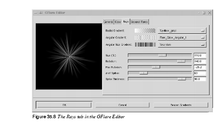
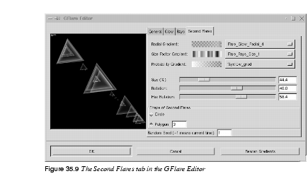
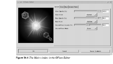 The GFlare Editor