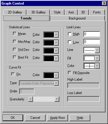
This tab give you a number of options for setting properties to show trends in your chart.
Trend property settings are described in the following table.
|
Setting |
Description |
|
Mean
|
Select this option to draw a mean line horizontally through the average value of all data points. Deselect it to remove the mean line. This option applies to scatter, line, high-low-close and open-high-low-close, candlestick, and box-whisker (parametric data only) graphs. |
|
Min/Max
|
Select this option to draw min and max lines horizontally through the lowest and highest data points in a set. Deselect it to remove the min and max lines. This option applies to scatter, line, high-low-close and open-high-low-close, candlestick, and box-whisker (parametric data only) graphs. |
|
Std Deviation
|
Select this option to draw a pair of standard-deviation lines horizontally through the standard deviation from the mean (in both the positive and negative directions). Deselect it to remove the standard-deviation lines. This option applies to scatter, line, high-low-close and open-high-low-close, candlestick, and box-whisker (parametric data only) graphs. |
|
Best Fit
|
Select this option to draw a best-fit line, which is a straight line indicating the trend of data points (a first-order polynomial curve). Deselect it to remove the best-fit line. This option applies to scatter, line, high-low-close and open-high-low-close, candlestick, and box-whisker (parametric data only) graphs. |
|
Color
|
Select colors for statistical lines from the selected color palette. By default, statistical lines are drawn in the same color as the data sets they apply to. If you select a color, it's applied to that type of line (mean, min/max, standard deviation, or best fit) for all data sets. |
|
On
|
Select this option to fit a curve through your data points. Deselect it to remove the curve. You can enable curve fitting for scatter, line, high-low-close and open-high-low-close, and box-whisker (parametric data only) graphs. |
|
Color
|
In this list box, select a color for the curve from the selected color palette. By default, curves are drawn in the same color as the data sets they apply to. If you choose a color, it's applied to the curves for all data sets. |
|
Curve Type |
This list box lets you choose a curve type with the formula shown below. Variable-Order Poly Polynomial curve of variable order Logarithmic y = a + b * log(x) Exponential 1 y = a * exp(b * x) Exponential 2 y = a * x * exp(–b * x) Power y = a * (x ^ b) Inverse 1 y = a + b / x Inverse 2 y = a / (b + x) Inverse 3 y = 1 / (a + b * x) Inverse 4 y = x / (a * x + b) Inverse 5 y = 1 / (a + b * x) ^ 2 Spline Spline fit through all points Moving Average Mid Moving average plotted at midpoint of
Moving Average End Moving average plotted at end point of
|
|
This option applies to three curve types: For variable-order polynomial curves, Order is the order of the polynomial used in curve fitting. A setting of 1 produces a straight line (the same as a best-fit line); a setting one less than the number of points produces a curve that passes through every point. For moving-average mid and moving-average end curves, Order is the range of data points over which moving averages are averaged, beginning with the first point. |
|
|
Granularity |
This scroll bar sets the granularity of all curve types except moving-average. The granularity is the number of steps, or straight line segments, making up the curve. Higher values create smoother curves but require more drawing time. The default granularity setting is 50 curve steps, which generally creates a smooth-looking curve at a high drawing speed. Each click to the left decreases the number of steps by 2 (to a minimum of 10), and each click to the right increases the number of steps by 2 (to a maximum of 1000). With spline curves, you generally need higher granularities than normal—up to 10 times the number of points in the graph. |