![]()
Welcome to HTML help for UtahSoft's Insta3D
Welcome to UtahSoft's Insta3D version 1.2, the excellent 3D scene maker
that lets you create stunning web and business graphics with 3D text and
3D charts. Now, with a few mouse clicks, you can make distinguished 3D
titles and 3D graphs for your documents, presentations, reports, videos,
and web pages. Insta3D needs OpenGL graphics library, which is included
with Windows NT, Windows 98 and later versions of Windows 95. This HTML
help file will take you through important topics and menu explanations
on how to use Insta3D.
Basic file operations in Insta3D
![]()
Adding text
Any Windows True Type fonts including special character fonts can be used to create 3D text. Multi-byte fonts like Chinese, Japanese, and Korean fonts are also supported.
After clicking the OK button on the text input dialog box, a 3D text is displayed in the center of the scene. At the same time, the object edit box on the left side becomes active and shows object properties such as Spacing, Bevel, Ratio, Extrusion, Quality and Color. It also shows already defined properties such as the Font, Size and Italic check box.
![]()
Changing text with edit box
1. Spacing controls the spaces between the letters of your text
in the range of between -5 and 5.
2. Bevel makes the edges of your text look chiseled. Higher
bevel width and height value makes a chiseled edge look wider.
3. Ratio value can make your text look wider or narrower. With
a higher value, the text becomes wider. The value can be set between 30%
and 200%.
4. Extrusion controls the depth(Z-value) of your text.
5. Color specifies the color of your text.
![]()
Adding a chart
To add a chart to a scene, click the Add chart icon which is located on the toolbar. To add a chart, you must pass through the selection and data input stages. By clicking the Add chart icon on the toolbar, the chart type selection dialog is displayed. After selecting a chart type, another dialog box is displayed. Here you can give a name to your chart and set the number of columns in a chart. Next comes the chart data input stage. The data input dialog box contains columns of input fields. The number of columns of the fields matches the number of columns set in the previous stage. Each column has a value, height and label fields. All the fields on the dialog box should be defined. To input data into the fields, move your cursor between the fields with the Tab key. Having completed the input, a 3D chart is created and displayed on the drawing window. A new chart is drawn with default colors.
After creation, the chart edit box on the left side shows the properties of the chart. Each type of chart has its own set of properties. Thus, the chart edit box automatically shows these properties according to the chart type. For example, Cut shape is a property that is reserved for bar charts and line charts while Clockwise direction is reserved for pie charts. A pie chart doesn't have Limit height and Spacing properties.
![]()
Changing a chart with the edit box
In the bar chart edit box...
1. Origin sets the center of a chart to either left, center
or right options. When rotated or scaled, this becomes an anchor point.
2. Spacing adjusts the distance between two adjacent bars of
a chart.
3. Scale height resizes the column height uniformly.
4. Color specifies the color of bars. With this color
button, you can assign a color to all the columns of a chart. If you want
to assign a color to a single bar, double click the bar and click the color
button on the chart data control dialog box that pops up. Then a color
selection dialog box will appear.
5. Cut shape determines the shape of a bar. Clicking on cut
shape lets you select a cut shape from the model list. With Cut
shape scale, you can resize the width and depth of a bar. When you
click the increase or the decrease button of the scale the resized bar
shape is immediately reflected on the 3D chart.
6. Label text property sets the text properties of labels, including
the color. If clicked, the label property dialog box will appear. To change
a label text, double click the bar where the label belongs. Then a chart
data dialog box will appear.
7. Value text property sets the text properties of values, including
the color. If clicked, the value property dialog box will appear. To change
a value text, double click the bar where the value belongs. Then a chart
data dialog box will appear.
8. Limit height sets the minimum and maximum height of bars.
If some of your chart data has oddly large or small height values, use
this control to limit the height by setting the minimum and maximum height
values and you can fit the entire chart within the drawing window.
9. Add column adds a new bar next to the last bar of a chart.
A newly added bar has the same height and color as the last bar.
10. Direction lets you select the direction and the order
of bars displayed. In other words, bars can be lined up either from left
to right, from right to left, from top to bottom, or from bottom to top.
In the line chart edit box...
1. Origin sets the center of a chart to either left, center
or right options. When rotated or scaled, this becomes an anchor point.
2. Spacing adjusts the distance between two adjacent bars of
a chart.
3. Scale height resizes height of a chart uniformly.
4. Line and joint forms the body of a line chart. A joint
connects two lines. Just click the line shape selection box or the joint
shape selection box to change the shape of a line chart. If you want to
make lines thinner or thicker, set the line Scale width and Scale
depth. To change the color of each line, just double click on the line
that you want to change.
5. Joint scale makes the size of the joint larger or smaller.
6. Color specifies the color of the line and the joint.
There are separate color editing buttons for the line and the joint. If
you want to assign a different color to a line, double click the line and
click the color button on the chart data control dialog box that pops up.
Then a color selection dialog box will appear. The same goes for joint
color selection.
7. Label text property sets the text properties of labels, including
the color. If clicked, the label property dialog box will appear. To change
a label text, double click the bar where the label belongs. Then a chart
data dialog box will appear.
8. Value text property sets the text property of values, including
the color. If clicked, the value property dialog box will appear. To change
a value text, double click the bar where the value belongs. Then a chart
data dialog box will appear.
9. Limit height sets the minimum and maximum height of bars.
If some of your chart data has oddly large or small height values, use
this control to limit the height by setting the minimum and maximum height
values and then you can fit the entire chart within the drawing window.
10. Add column adds a new line and joint pair next to the last
joint of a chart. A newly added line and joint pair has the same height
and color as the last line and joint pair of a chart.
In the volume chart edit box...
1. Origin sets the center of a chart to either left, center
or right options.
2. Spacing adjusts the distance between two adjacent bars of
a chart.
3. Scale height resizes the height of a chart uniformly.
4. Depth sets the depth of the volume.
5. Color specifies the color of a chart. If you want to assign
a different color to a line, double click the line and click the color
button on the chart data control dialog box that pops up. Then a color
selection dialog box will appear.
6. Label text property sets the text properties of labels, including
the color. If clicked, the label property dialog box will appear. To change
a label text, double click the bar where the label belongs. Then a chart
data dialog box will appear.
7. Value text property sets the text properties of values, including
the color. If clicked, value property dialog box will appear. To change
a value text, double click the bar where the value belongs. Then a chart
data dialog box will appear.
8. Limit height sets the minimum and maximum height of bars.
If some of your chart data has oddly large or small height values, use
this control to limit the height by setting the minimum and maximum height
values and then you can fit the entire chart within the drawing window.
9. Add column adds a new volume next to the last joint of a
chart. A newly added line and joint pair has the same height and color
as the last line and joint pair in the chart.
In the pie chart edit box...
1. Direction sets the winding direction of slices. Clockwise
direction adds a slice in a clockwise direction and counterclockwise adds
it in the opposite direction.
2. Outer Rad and Inner Rad control specifies
the inner and outer diameter of the pie slice. Setting the inner diameter
effectively makes a pie look more like a donut.
3. Depth sets the depth or height of a pie chart.
4. Bevel makes a chart edge chiseled.
5. Color specifies the color of a chart. But, in the case of
a pie chart, slices are usually distinguished with different colors. So,
to assign a color to an individual slice, double click a slice and then
a chart data dialog box will appear so that you can set the color of each
pie slice.
6. Label text property sets the text properties of labels, including
the color. If clicked, the label property dialog box will appear. To change
a label text, double click the bar where the label belongs. Then a chart
data dialog box will appear.
7. Value text property sets the text property of values, including
the color. If clicked, the value property dialog box will appear. To change
a value text, double click the bar where the value belongs. Then a chart
data dialog box will appear.
8. Add slice control inserts a new pie slice into a vacant area
of the pie chart. A new pie slice has the same label, value and color as
the last slice.
![]()
Move, Scale and Rotate an Object
Move positions your object on the scene along the selected axis.
If only the X-axis icon is selected, an object can be moved only to the
left or right. When only the Y-axis is selected, an object is moved only
in an up and down direction. The X-axis and Y-axis can be selected simultaneously,
then you can move your object freely. The X, Y, and Z-axis cannot be selected
together. In fact, the Z-axis can be selected only by itself. If the Z-axis
is selected, an object can be moved closer or farther away. Try selecting
an object by clicking on it and move the object with the left mouse button
pressed.
Scale sets the dimension of an object. The dimension can be
increased or decreased along a selected axis. Any single axis can be selected,
or two or three axes can be selected simultaneously.
Rotate sets the orientation of an object. The control causes
an object to revolve around a selected axis. The X and Y axis can be selected
simultaneously. But the X, Y, and Z-axis cannot be selected together. The
Z-axis can be selected only by itself.
When in move mode, pressing the Shift-key while moving the mouse
lets you scale an object. Likewise, pressing the Ctrl-key lets you
rotate an object.
![]()
Adding and changing a model and a panel
Panel is a box shaped object. It can be used as a board positioned behind a text or chart object. Panel object has the simple edit box that has Taper, Dimension and Color controls. Taper makes the side of box tapered. In addition, you may change the dimension of a panel. To have uniform taper on all four sides, you should use dimension control to change the size rather than using scale.
![]()
Changing image size and background
To change the background color of your work, click the Environment menu --> Background color command to open the color dialog box. You can select a color from a color picker.
![]()
Controlling the camera
![]()
Working with the color palette
![]()
Adjusting lighting
![]()
Adjusting colored light and spotlight
You can make a positional light act as a spotlight by restricting
the shape of the light it emits to a cone. To create a spotlight, the spread
of the cone of light should be specified.
You can change the spread of the cone with Cutoff Angle. You
also need to specify a spotlight's direction, which determines the
axis of the cone of light. Exponent controls how concentrated the
light is. The light's intensity is highest in the center of the cone and
attenuated toward the edges of the cone. The higher spot exponent results
in a more focused light.
![]()
Changing chart labels and values
![]()
Working with transformation box
![]()
Creating images
In TGA file format, you can save an image with the transparent background option. With the transparent background option, the background portion of the image becomes transparent by setting the alpha channel with a transparent value.
BMP image file format was developed by Microsoft and is the native graphics format for Windows users. BMP tends to store graphical data inefficiently, so the files it creates are larger than they need to be. If you use the image as windows wallpaper, create and use BMP image format.
JPG and GIF are the popular image formats for web graphics. Both the GIF and JPG image format are very compact. GIF images are limited to 256 colors, but JPG images can contain up to 16 million colors. While the GIF format is good for images like illustrations, the JPG format is suitable for images like photos. You can also save in GIF format with the transparent background option.
![]()
See also Basic file operation in Insta3D Creating images
![]()
Edit menu
![]()
View menu
See also Working with transformation box
![]()
Mode menu
See also Move, Scale, and Rotate an object
![]()
Create menu
See also Adding text Adding chart
![]()
Environment menu
See also Changing image size and background
![]()
Help menu
![]()
Toolbar
![]()
Text edit box
See also Changing text with edit box
![]()
Panel edit box
See also Adding and changing model and panel
![]()
Chart edit box
Model selection box
See also Adding
and changing model and panel
![]()
Color Palette
![]()
Color Dialog
![]()
Transformation Box
![]()
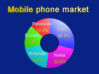
Tutorial #1 Making a simple pie chart

7. Click the Add chart icon and select pie chart. Then, set the
number of columns to 5.
8. In the next dialog box, input the data as below and click OK.

9. Click the Scale icon and select all the X,Y, and Z-axes.
10. With the left mouse button pressed, drag the pie chart to scale
it larger
11. Click the Label property button. Set the label size to 20
point to make it smaller, and set the label color to white.
12. Click the Value property button. Set the value size to 20
point to make it smaller, and set the value color to yellow.
13. Double click each pie slice and assign different colors.
14. Set the chart Bevel to 2 to make a beveled edge.
15. Click Rotate icon and select both the X-axis and Y-axis.
16. With the left mouse button pressed, move the mouse to the right
to rotate the chart a little. This will give your pie chart more of a 3D
look.
17. Input additional text information for the chart.
18. Click File --> Save, to save the scene into an apn
format file and edit the scene later.
19. Click File --> Create Image --> GIF or JPG,
to create an image file.
20. Congratulations! Now, you have created your first 3D chart
with Insta3D.

![]()
![]()