Figure A - You can define a specific bitmap graphic for each state of a custom pushbutton.

In the accompanying article, Resource Workshop tip - Displaying bitmaps in dialog boxes, we discuss some of the bitmap-displaying
abilities of the Borland Windows Custom Control (BWCC) library's
Pushbutton control. Actually, this control is two different controls
bundled together: a pushbutton control for which you can define
the appearance, and a static bitmap control. Here, we'll
take a closer look at how the BWCC Pushbutton control displays
corresponding BITMAP resources.
Originally, Borland developed the BWCC Pushbutton control to give developers like you more flexibility in displaying custom buttons. Instead of creating user-drawn control buttons (in which case you don't know until runtime whether the appearance is correct), you can use the Pushbutton control to define a button's appearanceand check that appearance at design-time.
Specifically, the Pushbutton control allows you to specify the appearance of a button for three conditions: normal, pressed, and highlighted (focused). To specify the appearance this way, you'll need to create a separate bitmap for each state. Then, if you assign the correct resource IDs to the different bitmaps, the Pushbutton control will use those bitmaps to display the appropriate image.

Figure A - You can define a specific bitmap graphic for each state of a custom pushbutton.
To allow the Pushbutton control to use the correct bitmaps, you'll
need to assign to the BITMAP resources identifiers whose values
relate to the Pushbutton control's ID by a constant offset
value. Table A lists the three pushbutton
states and the corresponding offset values you'll need
to apply to the appropriate BITMAP resources. (By the way, if
you want to define BITMAP resources that the control will display
on an Enhanced Graphics Array, or EGA, system, increase each offset
value by an additional 1000.) For example, if you create the
three bitmap images that appear in Figure
A and assign the resource IDs 1101, 3101, and 5101 to them,
a Pushbutton control that has a control ID of 101 will display
the appropriate bitmap image for each condition. Figure
B shows the three states of this Pushbutton control in
an example dialog box.

Figure B - If you correctly assign the control ID for the Pushbutton control and its three BITMAP resources, you'll see an appropriate image for each button condition.
Table A: Pushbutton offset values
| State | Offset Value |
| Normal | 1000 |
| Pressed | 3000 |
| Focused | 5000 |
Instead of creating a Pushbutton, you can create a Bitmap control. Fortunately, the process for assigning a BITMAP resource to a Bitmap control is the same as it is for Pushbutton controls.
As with the Pushbutton control, the Bitmap control displays a
BITMAP resource's image. However, since a Bitmap control
is a static control by nature, you don't need to worry
about assigning bitmap images for different states. A Bitmap control
will display any BITMAP resource image that has an ID value that's
1000 higher than the control's ID.
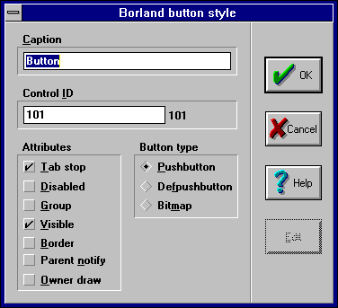
If you open the Borland Button Style dialog box for a Pushbutton control, shown in Figure C, you can change the control into a Bitmap custom control. To do so, you simply change the Button Type attribute. This is because Pushbutton and Bitmap controls use the same code. By the way, if you create all three bitmap images for a Pushbutton control and later change it into a Bitmap control, the Bitmap control will ignore the extra "pressed" and "focused" bitmap images.

Figure C - Instead of creating a Pushbutton control, you can create a Bitmap control using the Borland Button Style dialog box.
Copyright (c) 1996 The Cobb Group, a division of Ziff-Davis Publishing Company. All rights reserved. Reproduction in whole or in part in any form or medium without express written permission of Ziff-Davis Publishing Company is prohibited. The Cobb Group and The Cobb Group logo are trademarks of Ziff-Davis Publishing Company.