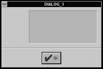
Figure A - Begin by creating a recessed group for text.

If your applications display dialog boxes, you've probably thought about ways you can improve their appearance. One of the most obvious ways is to add icons or bitmaps to the dialog boxes.
Adding an icon to a dialog box is a relatively straightforward taskyou create a new icon resource and then add the icon to the dialog box. Unfortunately, the maximum size for an icon is 64 by 64 pixels. If you want to display an image larger than that, you'll need to display a bitmap resource. However, there isn't a primitive resource type for displaying bitmaps, as there is for icons.
There are two basic methods for adding bitmaps to a dialog box. If you're writing an ObjectWindows Library (OWL) application, you can derive a new dialog box class from the TDialog class and override its Paint( ) member function to display a bitmap in a given location.
The other approach uses custom Windows controls from the Borland
Windows Custom Control (BWCC) library. In this article, we'll
show how you can use the Resource Workshop to add BWCC controls
to a dialog box and then display bitmap images using those controls.
If you've used any Borland product in the past several years, you've probably noticed how different the company's dialog boxes look compared to those in applications from other companies. The dialog boxes are different because Borland uses its own BWCC controls.
At first glance, the BWCC controls don't appear to provide any significant benefits. After all, if you use the CTL3DV2.DLL control library, you can create three-dimensional effects with raised or recessed boxes and vertical or horizontal bumps and dips.
However, the BWCC library contains a powerful Pushbutton control that's far more flexible than the standard pushbutton control. In fact, one of its many abilities is that it can serve as a simple bitmap-display control.
To use a BWCC Pushbutton control as a bitmap control, you need
to take three steps:
As soon as you specify the new control ID for the Bitmap control,
you'll see the data from the BITMAP resource appear in
the custom control's location. (To learn more about creating
BWCC Pushbutton controls and setting the control IDs this way,
see Pushbuttons, Bitmaps, and control IDs.)
The Resource Workshop, which Borland provides as part of the Borland C++ package, provides several resource editors that are integrated with a RES file compiler/decompiler. Using Resource Workshop, it's easy to create BITMAP resources and design dialog boxes for Pushbutton or Bitmap controls that use those resources. To see how easily you can create a dialog box that displays bitmap images via Bitmap controls, let's work through a simple example.
To begin, launch the Resource Workshop. (Some versions of Borland C++ name this application "Workshop.") When the Resource Workshop main window appears, choose New Project... from the File menu to create a new resource file. When the New Project dialog box appears, click on the RES radio button and then click OK.
When the UNTITLED.RES window appears, choose New... from the Resource menu. In the New Resource dialog box, select DIALOG in the Resource Type list box and click OK. When the DialogExpert dialog box appears, click on the Borland Dialog - Buttons On Bottom radio button and then click OK.
When the new dialog box appears in the dialog box editing window, select the Cancel and Help pushbuttons (pressing [Shift] allows you to select multiple items) and then press [Del]. Then, click on the OK pushbutton, choose Align... from the Align menu, and click the Center In Dialog radio button in the Horizontal Alignment group. Click OK to adjust the OK button's alignment.
Next, choose Custom... from the Control menu, select Recessed Gray Group from the Class combo box, and click OK. When the dialog box editing window reappears, place the new recessed group in the upper section of the dialog box, as shown in Figure A. You'll use this group to separate text from a bitmap image.

Figure A - Begin by creating a recessed group for text.
To add some information to the dialog box, choose Static Text from the Control menu and create a static text control that occupies the lower half of the recessed group. To change the text in this static control, double-click on it, enter This is a cool-looking dialog box that displays two bitmap images directly, and then click OK.
When the dialog box editing window reappears, choose New... from the Resource menu, select BITMAP from the Resource Type list box, and click OK. In the New Bitmap Attributes dialog box, enter 120 in the Width In Pixels entry field, enter 35 in the Height In Pixels entry field, click the 16 Color radio button, and click OK.
When the bitmap editing window appears, choose the Paint Bucket tool, click with the right mouse button on the light gray location on the palette (below the black entry), and then right-click inside the editing region (the red box) to create a light gray background.
Next, choose Font... from the Text menu and set the current font to Bold, 24 point, and Times New Roman; then click OK. When the dialog box editing window reappears, click on the Text tool and then click near the left side of the editing region.
Now, enter a fictitious company name, such as TylerSoft. When the text appears correctly, choose Rename... from the Resource menu. In the Rename Resource dialog box, enter 1101 as the new name for the bitmap, and click OK. When the bitmap editing window reappears, double-click on the editing window's System menu icon to close the window. (You can use a bitmap this way to display styled and formatted text. This allows you to use combinations of fonts or styles in the same dialog box.)
When the UNTITLED.RES project window reappears, double-click on the DIALOG_1 resource to redisplay its window. To create a new Bitmap control that displays the bitmapped text you just created, choose Custom... from the Control menu, select Bitmap from the Class combo box, and click OK.
When the dialog box editing window reappears, click in the upper section of the recessed gray group. Immediately, you'll see the bitmapped text appear in the group, as shown in Figure B. (The Bitmap control class sizes itself automatically based on the bitmap image's dimensions.)
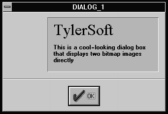
Figure B - You can add styled text as a bitmap image by using the Bitmap custom control.
Now, we'll use this same technique to add a second bitmap
to the left of the recessed group. To begin, choose New...
from the Resource menu, select BITMAP from the Resource Type list
box, and click OK. In the New Bitmap Attributes dialog box, enter
64 for both the height and width of the bitmap, click the
16 Color radio button, and click OK. When the bitmap editing window
appears, create a simple graphic, such as that shown in Figure
C.
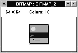
Figure C - You can use the built-in editor in Resource Workshop to create bitmaps.
When you finish creating the bitmap, choose Rename... from the Resource menu. In the Rename Resource dialog box, enter 1102 as the new name for the bitmap and click OK. Close the bitmap editing window when it reappears.
Return to the DIALOG_1 window to add the second Bitmap control. Choose Custom... from the Control menu, select Bitmap from the Class combo box, and click OK. To place the new bitmap in the dialog box, click in the empty region to the left of the recessed group. When you finish, the dialog box should resemble the one that appears in Figure D.
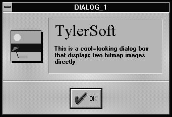
Figure D - You can improve the appearance of any dialog box by using Bitmap controls to display bitmap images.
To try out the new dialog box, choose Test Dialog from the Options
menu. When you finish viewing the dialog box, you can click the
OK button to dismiss it.
You can add bitmap images to dialog boxes to give your application
a more polished, professional appearance. While you can accomplish
this using any of several ObjectWindows programming techniques
that modify dialog box behavior, you can achieve the same effect
by taking advantage of the BWCC Pushbutton control's ability
to display custom bitmaps.
Copyright (c) 1996 The Cobb Group, a division of Ziff-Davis Publishing Company. All rights reserved. Reproduction in whole or in part in any form or medium without express written permission of Ziff-Davis Publishing Company is prohibited. The Cobb Group and The Cobb Group logo are trademarks of Ziff-Davis Publishing Company.