
 |
     |
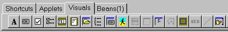
 DESCRIPTION: Components are the building blocks of every Iavadraw Application, and the base of the Iavadraw tools. The Visual-page tab displays a group of icons representing the components used to design your application interface. Components can be either visual or non-visual. Each component has specific attributes that enable you to control your application. These attributes are Properties, Events and Methods. The Component palette provides Help Hints. Help Hints display a small pop-up window containing the name or brief description of the button when your cursor is over the button for longer than one second. IMPORTANT The use of Iavadraw's visual components is possible in projects only. IAVADRAW'S VISUAL COMPONENTS:
1 ... Label component VISUAL INTERFACE | LABEL COMPONENTDESCRIPTION: Displays text that the user cannot select or manipulate, such as title text. Purpose: Use a label to display text that the user cannot edit, for example, to display a name for components that do not have their own Caption property. available Properties:
Color: the color of the label
FontColor: the color of the font VISUAL INTERFACE | BUTTON COMPONENTDESCRIPTION: Creates a pushbutton control that users choose to initiate actions. Purpose: Use the Button component to provide buttons users can choose to carry out commands. available Properties:
Caption: the caption of the button available Events:
onClickEvent VISUAL INTERFACE | CHECKBOX COMPONENTDESCRIPTION:
Use the CheckBox component to present Yes/No or True/False options to the user, particularly where more than one choice at a time is available from a group of choices. available Properties:
Caption: the caption of the checkBox available Events:
onClickEvent VISUAL INTERFACE | CHECKBOX GROUPDESCRIPTION: The CheckBoxGroup component lets you easily create a checkboxgroup on the Visual Form. available Properties:
ChildCount: VISUAL INTERFACE | TEXTFIELDDESCRIPTION: Displays an editing area where the user can enter or modify a single line of data. Purpose Use a textField to read or write a single line of text (the TextField component does not recognize end-of-line or carriage return characters). To read and write multiple lines of text, use the TextArea component. To display text that the user cannot modify, use the Label component. available Properties:
Height: the height of the TextField available Events:
onKeyPress VISUAL INTERFACE | TEXTAREADESCRIPTION: Displays an editing area where the user can enter or modify multiple lines of data. Purpose: The TextArea component provides an area for text manipulation. Use the TextArea component to read in multiple lines of text, whether entered by the user or programmatically. (Contrast with the TextField component, which handles only single lines of text.) available Properties:
Height: the height of the TextArea
Name: the name of the TextArea, set by Iavadraw VISUAL INTERFACE | FILE DIALOG COMPONENTPurpose Displays files and enables the user to select them in the current directory. available Properties:
Caption: the caption of the Filedialog VISUAL INTERFACE | LISTBOX COMPONENTPurposeUse the ListBox component to display a scrollable list of items that users can select but cannot directly modify. You need to populate the list box programmatically, as users cannot enter or edit items in the list. Available Properties
Width: the width of the listbox component
Items: the items of the listbox component VISUAL INTERFACE | MESSAGEFRAME COMPONENTDESCRIPTION: The MessageBox method displays a generic dialog box that displays a message and one or more buttons. available Properties:
Caption: the caption of the MessageFrame Documentation:
function
Value 0 = OkButton VISUAL INTERFACE | IMAGE COMPONENTDESCRIPTION: Displays an image. Purpose: Use the image component to display an image on your visual form. available Properties:
Filename: the color of the label VISUAL INTERFACE | PANEL COMPONENTDESCRIPTION Use the Panel component to create a container which can contain other components. Available Properties
Top: the distance to the top of the visual form VISUAL INTERFACE | MENUBAR COMPONENTDESCRIPTION Use the MenuBar component to create a menu bar at the top of your application. Available Properties
Top: the distance to the top of the visual form VISUAL INTERFACE | FIND DIALOG COMPONENTDESCRIPTION: The FindDialog component lets you easily create a FindDialog on the Visual Form. Available Properties
Name: the name of the FindDialog Documentation: function
public string getSearchtext = The text you want to search for. DESCRIPTION: The Form component is at the center of Iavadraw applications, when you start a new applet, standalone or bean project. You design your application by putting other visual- or beanscomponents on a form. Select the component that you want from the visual component bar or the beans component bar and click on the Visual Form. Now you can set the properties and the events for the specified component in the inspector. The look of the visual form mirrors the look of your applet or application when viewed in your HTML-browser, Appletviewer or Java interpreter when you compile the java-file.
DESCRIPTION: With the inspector you can set the properties and the events of the visual components. The inspector is your tool for creating your applications and the gateway between your applications visual appearance and the code that makes your application run. The Inspector enables you to set design-time properties for the visual components or beans components you have placed on the visual Form (or for the form itself), and create and help you navigate through event handlers. The inspector has three pages: Values: The Values page of the Iavadraw Inspector enables you to set design-time properties for components on your form, and for the form itself. You can set run-time properties by writing source code inside event handlers. The Values page displays only the properties of the component that is selected on the form. By setting properties at design time you are defining the initial state of a component. Events: The Events page of the Object Inspector enables you to connect forms and components to program events. When you double-click an event from the Events page Iavadraw creates an event-handler and then switches focus to the Editor. In the Editor you write the code inside event-handlers that specify how a component or form responds to that particular event. The Events page displays only the events supported by the component that is selected in the form. You can set events by double-clicking on the event you want. Methods: Shows you all methods the component is actually capable of using.
OnClickAn OnClick event occurs when the user clicks the component.OnKeyPressThe OnKeyPress event occurs when a user presses a single character key. Use the OnKeyPress event handler when you want something to happen as a result of a single character key press.OnMouseDownThe OnMouseDown event occurs when the user presses a mouse button with the mouse pointer over a control. Use the OnMouseDown event handler when you want some processing to occur as a result of pressing a mouse button. The Button parameter of the OnMouseDown event identifies which mouse button was pressed. By using the Shift parameter of the OnMouseDown event handler, you can respond to the state of the mouse buttons and shift keys. Shift keys are the Shift, Ctrl, and Alt keys.OnMouseMoveThe OnMouseMove event occurs when the user moves the mouse pointer while the mouse pointer is over a control. Use the OnMouseMove event handler when you want something to happen when the mouse pointer moves within the control. By using the Shift parameter of the OnMouseDown event handler, you can respond to the state of the mouse buttons and shift keys. Shift keys are the Shift, Ctrl, and Alt keys.OnMouseUpThe OnMouseUp event occurs when the user releases a mouse button that was pressed with the mouse pointer over a component. Use the OnMouseUp event handler when you want processing to occur when the user releases a mouse button. The OnMouseUp event handler can respond to left, right, or center mouse button presses and shift key plus mouse-button combinations. Shift keys are the Shift, Ctrl, and Alt keys.OnKeyReleaseThe OnKeyUp event occurs when the user releases a key that has been pressed. Use the OnKeyUp event handler when you want special processing to occur when a key is released. The OnKeyUp handler can respond to all keyboard keys, including function keys and keys combined with the Shift, Alt, and Ctrl keys.
|


| [Home | News | Future views | iavaDraw | iavaZIP | Information | Purchase license | Download | Contact | Consulting | WebService | About | Business | Press releases ] |
| Copyright © 1997 SFS Software GbR - All rights reserved. |