- Combo Boxes provide lists of items from which the user can select by clicking on an item. Use the Combo Box tool to draw the object. The tool appears as follows:

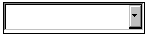
- The following figure shows an example of how a Combo Box might appear within Jamba.
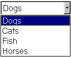
- Items that you enter in the list cannot be seen in the Page Layout Editor. However, the following figure shows how a Combo Box might appear at runtime.
- You determine the size of the object when you draw it. If there are too many items to all be visible at once, the object has a scrollbar. Use the Font and TextColor properties to control the font and color of characters in the Combo Box. The ColorBackground property sets the color of the area behind the text.
- Use the ItemList property to specify the items that you want to appear in the object's list. The ItemList property lets you open the ItemList Properties dialog box.
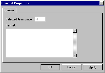
- Type each item, pressing Return to start a new item line. The "Selected item number" field lets you identify which item you want to be selected when the object first displays. The default is -1 which means that none of the items are selected. Specify 1 to select the first item in the list, specify 2 to select the second item, and so on. Note that this characteristic can also be set via the SelectedItemNumber property. When you are finished entering items, press OK to close the dialog box and return the items to the ItemList property.
- When a user makes a selection from a list at runtime, the object's SelectedItemData property is set to the item that the user selected. In effect, the applet uses this property to "capture" the user's input. Your applet can use this information to set another property or method at runtime.
- If you want to manipulate the captured value, you refer to it using the Object.Property syntax. For example, if you want to manipulate the value currently stored in the SelectedItemData property of ComboBox1, you would specify the value ComboBox1.SelectedItemData.
- An applet can use the value captured by the SelectedItemData property to set another property that uses the same kind of value that the user selected. For example, consider an applet that contains ComboBox1 and Audio1. You can set up the list so that it displays several audio filenames. You can then instruct the user to select a filename from the list. When the user selects an item, it is captured by the SelectedItemData property. You can then set the Filename property of Audio1 using ComboBox1.SelectedItemData.
- See the section called "Lesson: User-Defined Actions" in Chapter 2 for a lesson on creating an applet that uses a List Box. Note that the Combo Box functions almost identically to the List Box object. The only difference is that all the items in the Combo Box list are seen only when the user clicks on the drop-down arrow.
- The Combo Box objects support the following properties, methods, and events:
|
Properties
|
Methods
|
Events
|
|
BackgroundColor
|
MoveAndSize()
|
Create
|
|
Enabled
|
SlideTo()
|
Hide
|
|
Font
|
|
Select
|
|
Height
|
|
Show
|
|
HowToHide
|
|
SlideToComplete
|
|
HowToShow
|
|
|
|
ItemList
|
|
|
|
Name
|
|
|
|
SelectedItemData
|
|
|
|
SelectedItemNumber
|
|
|
|
TextColor
|
|
|
|
Visible
|
|
|
|
Width
|
|
|
|
X
|
|
|
|
Y
|
|
|


