|
| |
> Understanding the Graphical View of Safe Color Settings |
Understanding the Graphical View of Safe Color Settings
The Safe Color Settings dialog box includes a graphical indication of the current limit values in relation to the default values. This allows you to quickly check that your limits are consistent with one another and within an acceptable range without having to read all the numerical limit values and remember the default values.
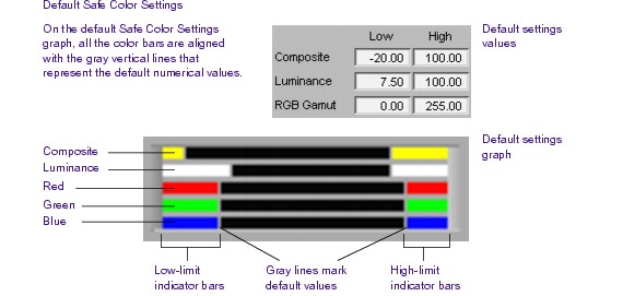
The following illustration shows the location of this graph within the Safe Color Settings dialog box. All settings in this illustration are at their default values.
The graph shows colored bars that represent the current low and high levels for each limit type. The colors are the same as those used to display safe color warnings in the monitors. It also displays gray vertical lines that represent the default high and low levels for each limit type.
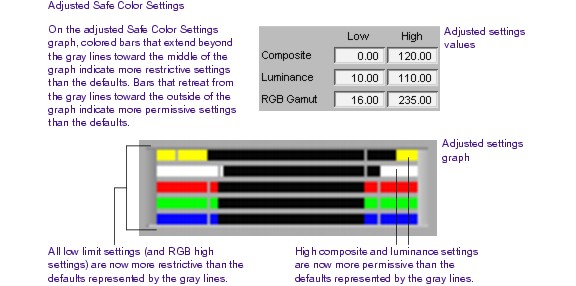
The following illustrations present two graphs in detail — the first showing default levels and the second showing adjusted levels — and explain how to interpret the graphs.