| Sample Themes | |
|
Following are some of the themes that I've made for SysMetrix. I've included them here just to give you an idea
of what SysMetrix can do. The themes vary from simple to complex, and each theme can be radically different
from the next. These themes and others are automatically available since they're part of the standard installation.
You can also download more themes for SysMetrix from popular skinning web sites such as
WinCustomize
and SkinBase
and DeskMod
and ArtUproar.
|
|
|
Shex Panel |
|
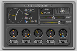
Here's a theme that I made to demo some of the recently added control types.
In the upper left there's an analog clock with other time and date information including my system's uptime.
Moving to the right, there are lights that indicate when I've got email and when there's stuff in my recycle bin. These are accomplished via the dual-state image object.
On the upper right is a histogram displaying the CPU usage history along with the current value of CPU usage.
Below the CPU histogram are two horizontal sliders that represent the percentage of physical and swap memory in use.
At the bottom is a panel of multi-state images in the form of analog guages that are used to show the usage of drives C through G.
In addition to the analog guage, there's a textual display of the current usage percentage.
|
|
|
Graphican |
|
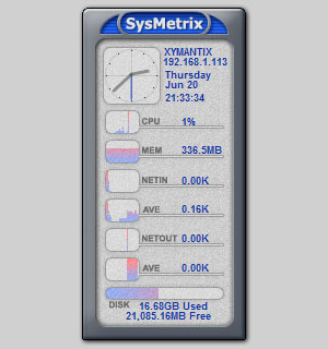
Here's a theme that I made to a while back to complement a NextStart theme of mine by the same name.
This was done a little while after I added a bunch of the metering capabilities. It was also the first
theme that showed off the image-based histograms and bargraphs. Notice that this one shows more of the
network statistics, such as hostname, IP address, TCP Bytes in, Average TCP Bytes In, TCP Bytes out, and
Average TCP Bytes Out.
|
|
|
SimplexDK |
|
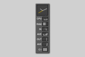
Here's a theme that I made to a while back to complement another NextStart theme.
This one demonstrates that it doesn't have to be big to be useful. You can actually fit a
lot of information in a small space.
|
|
|
Jewel |
|
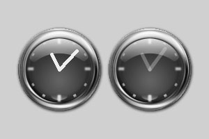
Here's one of the first themes that I made for it back when it was only a clock.
These two pictures compare the two different modes of drawing the clock hands. On the left, they are not antialiased
and are fully opaque. They look like they were slapped on the background instead of integrated into it. On the right
the hands are anti-aliased (no more jaggies!) and partially transparent. Because of that, they blend into the background
better and look like a real part of the clock. See how the minute hand is brighter on the end where the glare on the
clock face lights it up?
|
|