Feature tour: 3. Customization
THERE are a number of ways you can customize the Webstyle templates. In fact the range of customization options available means that you can radically change the appearance of all the Webstyle templates, giving you almost limitless possibilities for graphic creation.
TextWith graphic types that include text, you can alter the font, spacing, aspect ratio, positioning and size of the text. There are two text dialogs, a Simple one which just has font and size options, and an Advanced version which includes the full range of options (shown below). 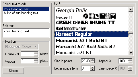 Figure 3.1. Advanced text dialog ColorWebstyle allows you to change the color of all elements
within a graphic. The number of editable elements is different for
each template. For example, one template might have a sub-heading
element, whereas another might not.   Figure 3.2. Simple color dialog TextureAs well as changing the background color of a template, you could choose to apply a tiling background texture instead. There are dozens of different textures to choose from and they are organized into the following categories: Dimpled, Exotic, Fibrous, Geometric, Misty, Ripples, Stippled, Stone and Wood. BevelYou can change the bevel attributes on all the 3D Heading templates. There are 15 different bevel types to choose from, including Rounded, Triangle faced and Curved. You can alter the bevel depth and the extrusion depth too.  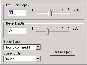 Figure 3.3. Bevel dialog ShadowShadows are a great way of giving your web graphics extra depth, and in Webstyle you can add them with the simple click of a button. There are eight different shadow types to choose from on the Simple shadow dialog (below). 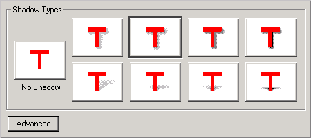 Figure 3.4. Simple Shadow dialog If you want to further customize the appearance of the shadow, you can select the Advanced shadow dialog (below) to see further options to change the darkness, blur and positioning. 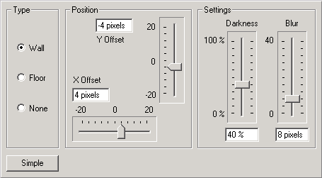 Figure 3.5. Advanced Shadow dialog SizeChanging the size of a Webstyle graphic couldn't be simpler: just drag the size slider or manually enter a new width or height and the graphic will be resized in real time.  Figure 3.6. Size dialog If a template has more then one element - for example a heading which has an associated sub-heading - then the second component can have its size changed too. NavBars & menusNavBars are subject to all the above customizations,
but they have their own special dialog too. 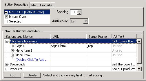 Figure 3.7. NavBar properties dialog The Menu Properties section is where you can alter the look of any dynamic menus you might have added to your NavBar. You can change the font, menu direction, font-size and spacing. You can also make the menu semi-transparent or add a simple animation to it: 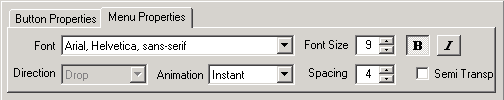 Figure 3.8. Menu properties dialog
|
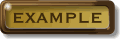
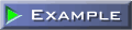
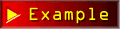
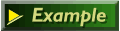
 You can see from these examples that
by taking one of the standard button designs,
you can customize it to create a variety of
different buttons. The same applies to all
graphic types.
You can see from these examples that
by taking one of the standard button designs,
you can customize it to create a variety of
different buttons. The same applies to all
graphic types.