A button player is a special type of sprite that can have two or three images. As the user performs mouse actions on the button, the images flip in a manner that depends on the type of button.
For example, a checkbox can flip back and forth between two images depending on whether the user wants the button to indicate On or Off. A third image can highlight the button when the mouse moves over it to indicate that it is active.
A button player is visible, playable, and postable.
There are three types of button players:
Use push buttons and a handler to generate an action within the mbedlet. You give the button three different images for its data. One image represents its default state, another represents its mouseover state, and the third represents the mousedown state. As the user passes the mouse over the button, it shows the mouseover graphic so that the button looks "active". When the user clicks on the button, it shows the mousedown graphic so that the button looks "on". The user click also sends a MOUSEDOWN message to the button player. You can create a handler on the button player causing some action to occur when it receives the MOUSEDOWN.
Use a checkbox when the state of the button player (on or off) should cause different actions.
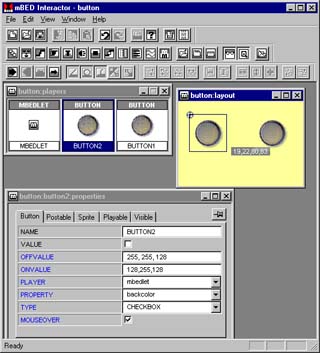
A checkbox is in the "off" state by default. A user click sends a toggleon message to the checkbox and switches it to the "on" state. Another user click sends a toggleoff message and the checkbox switches to the "off" state. Handlers allow you to specify the events that occur in the button player's off state and on state. Or you can change properties of another player when the button switches "on" or "off". The buttons in the example below are checkboxes. You see that when the first button is switched "on" it changes the background color of the mbedlet and shows its "on" graphic.
You can use a checkbox to get user information that will be posted to a server.
Use a radio button to allow the user to choose one out of a set of choices. At any time, only one radio button in the set can be turned "on". When the user selects a radio button, the mbedlet automatically toggles off the previous selection.
You can use a radio button to get user information that will be posted to a server.
To create a button player, go to the Players toolbar and click on Button. A new button player appears in the Players window, already selected. You will now:
To specify the image associated with a button player:
The first image you chose (for the default state) now appears within the button player in the Players window. You can use the Flip Forward and Flip Back buttons in the Control toolbar to flip through all three images.
To set the properties for the button player, go to the toolbar and click on the Properties button. In the Property sheet, set the button properties as follows:
| Property | Purpose |
| MOUSEOVER | If you included an image for the mouseover state, set this property to on so that the image is displayed. |
| VALUE | For a radio button or checkbox, determines whether the button will be in the on state or off state when the mbedlet starts up. |
| OFFVALUE | If you set the button's POSTABLE property to on, specifies the
postable value for this button player's off state in an mbedlet form.
If you enter a value for PLAYER and PROPERTY, specifies the value to which another player's property is set when this button player is off. |
| ONVALUE | If you set the button player's POSTABLE property to on, specifies
the postable value for this button player's on state in an mbedlet form.
If you enter a value for PLAYER and PROPERTY, specifies the value to which another player's property is set when this button player is on. |
| PLAYER | Specifies a player whose property changes according to the state of
the button player. The players you can choose are listed on the pulldown
menu.
If you specify a value for PLAYER, you must also specify a value for PROPERTY. |
| PROPERTY | Specifies another player's property that changes according to the state
of this button player. The properties you can choose are listed on the
pulldown menu.
If you specify a value for PROPERTY, you must also specify a value for PLAYER. |
| TYPE | Sets the button type to push button, radio button, or checkbox. |
Because a button player can have a series of images that change, essentially a button is a form of sprite. Under the Sprite tab, set the button's sprite properties.
Under the Visible tab, set the button player's visible properties.