Create panel > Helpers > Manipulators > Object Type rollout > Slider button
The Slider manipulator is a graphic control that appears in the active viewport. By wiring its Value to a parameter of another object, you can create a custom control, with visual feedback, within a scene.
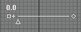
Slider manipulator
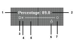
Slider manipulator components:
1 Label
2 Value
3 Move
4 Show/hide
5 Slider bar
6 Adjust value
7 Change width
The slider appears in the same location in whichever viewport is active.
You can adjust the slider's value by dragging the triangle below the slider bar. The triangle turns red when you move the mouse over it. It represents the slider's value, and the value changes as the triangle is dragged. You can also make the following changes without going into the Modify panel:
Dragging the small square at the left moves the slider.
Dragging the diamond at the right changes the width of the slider.
Clicking the plus sign (next to the move icon at the left) hides all of the slider except for the label and the move icon.
Like the Value triangle, these components also turn red when you move the mouse over them.
Procedures
To create a slider manipulator:

 In the Create panel, go to Helpers and choose Manipulators from the drop-down list.
Click to turn on Slider.
Click a viewport.
The slider manipulator is created with its default width of 100 units. It will appear at the same viewport location in whichever viewport is active.
To change the value of a slider manipulator:
 Turn on Select and Manipulate.
The slider turns green.
Tip:
 If you are still in the Create panel, turn on Select Object before using the manipulator. Otherwise, it is too easy to create a new one.
In a viewport, move the mouse over the triangle below the slider bar.
The triangle turns red when the mouse is over it and it is available to be dragged.
Drag the value triangle of the slider manipulator.
The slider's value display changes as you drag the triangle.
To move a slider manipulator:
Turn on Select And Manipulate.
In the active viewport, move the mouse over the move icon, which is the small square at the left of the slider, below the sliders label (if there is one) and value display.
The square turns red when the mouse is over it and it is able to be dragged.
Drag the box to move the slider.
Unlike angle manipulators, transforms have no effect on sliders.
To connect a slider manipulator so it controls another object:
Select the slider.
Note:
Select And Manipulate must be off before you can select the slider.
Choose Animation > Wire Parameters > Wire Parameters.
You can also right-click the manipulator and choose Wire Parameters from the Transform (lower-right) quadrant of the quad menu.
A pop-up menu appears over the manipulator.
In the pop-up menu, choose Object > Value.
Drag to the object you want to manipulate, and click it.
A pop-up menu appears over the object.
In the pop-up menu, choose Object, then the name of the parameter you want to manipulate.
The Parameter Wiring dialog appears.
In the Parameter Wiring dialog, make sure the direction goes from the slider to the object (or both directions), and then click Connect.
Close the Parameter Wiring dialog.
Now when you turn on Select And Manipulate and use the slider, the object updates under the slider's control.
Interface

Name: The slider label that appears in viewports. Default=none.
Value: The value of the slider, based on the position of the slidable triangle. Default=0.0.
Min: The minimum possible value of the slider. Default=0.0.
Max: The maximum possible value of the slider. Default=100.0.
When the minimum is 0.0 and the maximum is 100.0, the slider Value can represent a percentage.
X Position: The slider's X location in the active viewport. Default=Viewport X location you clicked when you created the slider.
Y Position: The slider's Y location in the active viewport. Default=Viewport Y location you clicked when you created the slider.
Width: The slider's width, in gmax units. Default=100.0.
Snap: When on, the slider "snaps" to incremental values. When off, Default=on.
Snap Value: The increment used by the slider when Snap is on. Default=0.01.
Hide: When on, hides all of the slider except for the label and the move and show/hide components. Default=off.