Animation Menu > Add Custom Attribute
Custom attributes let you create and assign additional parameters to any object, modifier, or material in your scene. These are abstract parameters, in the sense that the object to which they are applied does not know about them. They do not directly extend the functionality of the object; however, they can indirectly affect the functionality of the object by using wire parameters or expression controllers. They can also be useful for keeping and editing job-specific data.
These parameters behave like other parameters in the object:
They get saved and loaded in the .gmax file along with the object.
They can be animated, keyframed, and so on.
They are displayed in Track View along with the base parameters.
Custom attributes can contain integers, floating numbers, Booleans, arrays, nodes, colors, or texture maps. They are displayed in custom rollouts which appear on the Modify panel. For each custom attribute that you create, you can edit the name, layout, default values, and UI type (spinner or slider for floats and integers, checkbox for Booleans, and so on.).
As you customize your attribute, the result is displayed in the Testing Attribute rollout at the bottom of the dialog.
Interface
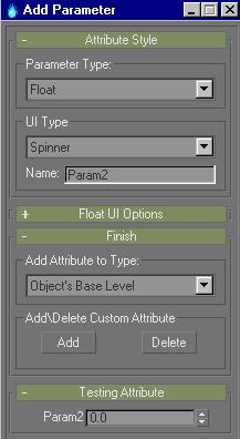
Attribute Style rollout
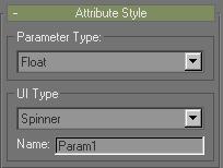
Parameter Type group
Parameter Type: Selects the type of parameter to create.
Custom parameters can have float, integer, Boolean, array, node, color, or texture map values.
UI Type group
UI Type: Selects the type of UI element that controls the parameter.
The UI types available depend on which parameter type you specify. Float and integer values are controlled by spinners or sliders, and Boolean values by check boxes or check buttons. However, array values are always controlled by drop-down lists, node values by pick buttons, color values by color pickers, and texture map values by map buttons.
Name: Changes the name of the attribute.
Float/Integer UI Options rollout: Spinner

Size group
Width: Sets the width of the spinner.
Range group
From: Sets the minimum value of the spinner.
To: Sets the maximum value of the spinner.
Default: Sets the default value of the spinner.
Alignment group
Left, Right, and Center buttons: Sets the alignment of the spinner in the rollout.
Float/Integer UI Options rollout: Slider

Size group
Width: Sets the width of the slider.
Range group
From: Sets the minimum value of the slider.
To: Sets the maximum value of the slider.
Default: Sets the default value of the slider.
Alignment group
Left, Right, and Center buttons: Sets the alignment of the slider in the rollout.
Orientation And Ticks group
Vertical: When checked, the slider will be displayed vertically. When unchecked, the slider is displayed horizontally.
Ticks: Sets the number of ticks along the slider. These ticks are automatically spread out along the length of the slider.
Note: Ticks are only available on vertical sliders. They do not appear on horizontal sliders.
Boolean UI Options rollout: Check Box

Size group
Width: Sets the width of the check box.
Height: Sets the height of the check box.
Alignment group
Left, Right, and Center buttons: Sets the alignment of the check box in the rollout.
Boolean UI Options rollout: Check Button

Size group
Width: Sets the width of the check button.
Height: Sets the height of the check button.
Alignment group
Left, Right, and Center buttons: Sets the alignment of the check button in the rollout.
Check Button Options group
Highlight Color: Sets the color of the button when it is pressed.
Array UI Options rollout: Drop-Down List

Size group
Width: Sets the width of the drop-down list.
Height: Sets the height of the drop-down list.
Alignment group
Left, Right, and Center buttons: Sets the alignment of the drop-down list in the rollout.
Array group
Item name: Lets you enter a name into the drop-down list.
Press Add Item to add the name into the array list. Press Clear Array to remove all items from the list.
Array list: Displays the contents of the drop-down list.
The item at the top of the array list is the default selection.
Node UI Options rollout: Pick Button

Size group
Width: Sets the width of the pick button.
Height: Sets the height of the pick button.
Alignment group
Left, Right, and Center buttons: Sets the alignment of the pick button in the rollout.
Color UI Options rollout: Color Picker

Size group
Width: Sets the width of the color picker.
Height: Sets the height of the color picker.
Alignment group
Left, Right, and Center buttons: Sets the alignment of color picker in the rollout.
Color Picker Default Color group
Default Color: Sets the default color of the color picker.
[MG - check for validity once new MaterialED is in]
Texture Map UI Options rollout: Map Button

Size group
Width: Sets the width of the map button.
Height: Sets the height of the map button.
Alignment group
Left, Right, and Center buttons: Sets the alignment of the map button in the rollout.
Finish rollout
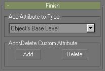
Add Attribute to Type group
Type list: Select whether the custom attribute is assigned to the currently selected object, modifier, or material.
Add\Delete Custom Attribute group
Add: This will attach the custom attribute that you have created to the currently selected object, modifier, or material (depending on what you have selected in the type list).
The custom attribute will immediately display in the Modify panel.
Delete: Opens the Delete UI Item dialog.
This dialog displays a list of all of the custom attributes assigned to the currently selected object. Select an attribute and press Delete Selected to remove it from the object. You can also press Delete All to delete all of the custom attributes assigned to the currently selected object.
Testing Attribute rollout
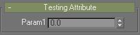
This rollout displays the UI layout for the custom attribute that you are working on. It updates continuously so that you can see how different settings in the various rollouts affect the UI display of the attribute.
The attribute is operational in this rollout, in the sense that it can be moved, pressed, checked, and so on.